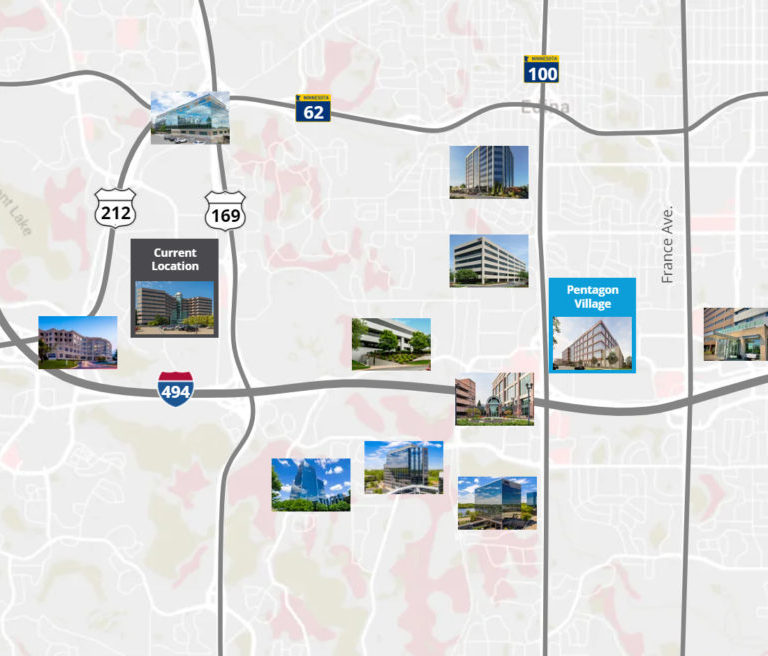
Bloomington Real Estate Map
A Colliers office broker wanted to show the amenities, transportation, and high-value projects surrounding the Riverview Office Tower. I developed this interactive map to show the proximity and specifics of these areas of interest. View the map here.