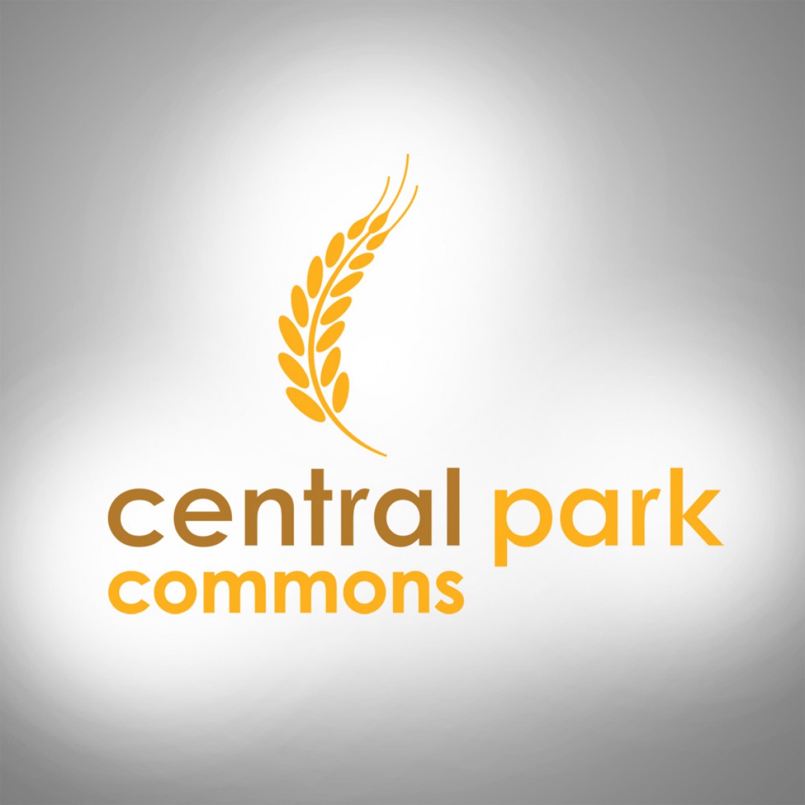
This logo was created for a retail center in Eagan, MN. The developers wanted a modern look while retaining a symbol of wheat farming that was the bedrock of Eagan’s history. The sans-serif typeface of the mark conveys the modern feel of the development and the wheat symbol and gold/brown colors relay Eagan’s past.
