Showing 12 Result(s)
Kip's Pub Website

Kip’s Pub Website

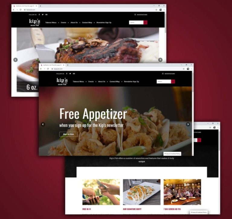
In 2017, Kip’s Irish Pub decided to upgrade its menus. They wanted to create a finer dining experience for their customers while still retaining their identity as a pub. From a marketing perspective, it was important to update the Kip’s Pub brand. The new menus did not reflect the existing brand as a rustic and …

Stay Twin Cities Branding

Stay Twin Cities Branding

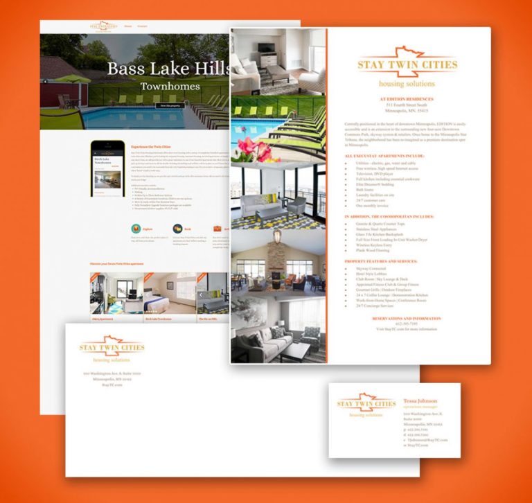
The executive housing division of CSM Corporation decided to end its partnership with Oakwood/ExecuStay. Because of this, they were in need of a new identity. Through research and speaking with them, Stay Twin Cities was developed. Their primary differentiator from their competitors was that they were “executive housing with a heart” so the bright yellows …

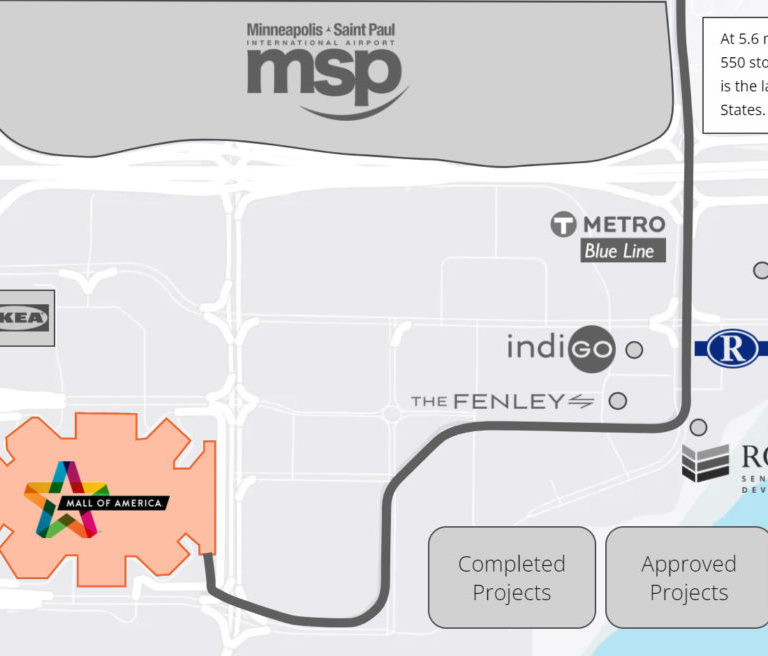
Bloomington Real Estate Map

Bloomington Real Estate Map

A Colliers office broker wanted to show the amenities, transportation, and high-value projects surrounding the Riverview Office Tower. I developed this interactive map to show the proximity and specifics of these areas of interest. View the map here.

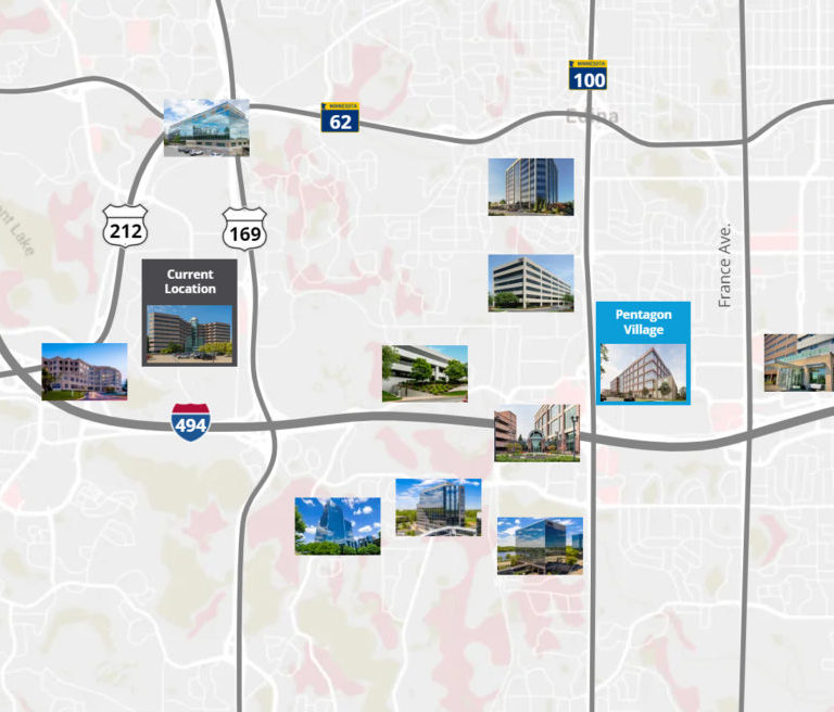
West/Southwest Metro Real Estate Map

West/South Metro Real Estate Map

A client of Colliers wanted to see the real estate options available to them in the west and southwest metro and so I created a map to show real estate options. Since the options are localized in two distinct areas, I decided to create two sub-maps since if all options were displayed on one map, …

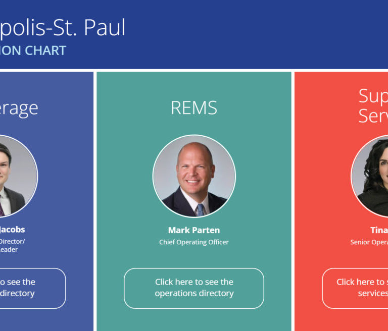
Interactive Org Chart

Interactive Org Chart

The Colliers Minneapolis-St. Paul had a challenge. With over 60 brokers, 40 real estate management professionals, and 20 support personnel, how do you display them all without making the final project confusing and complicated? I devised this solution to show only the relevant information that the user was looking for as opposed to showing everything …

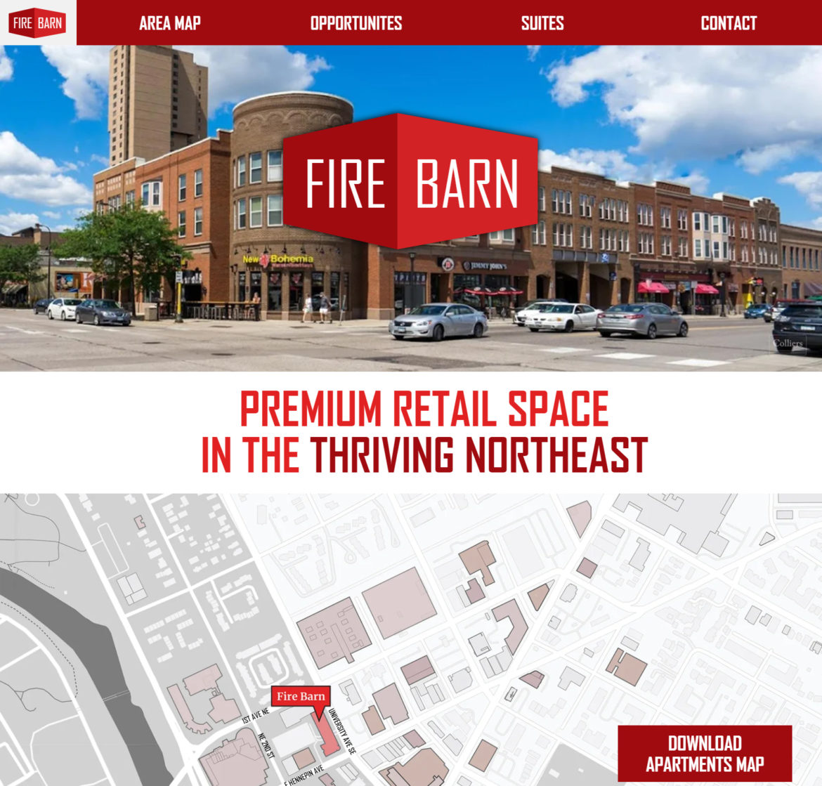
Fire Barn Website

Fire Barn Website

The owner of the Fire Barn building in Northeast Minneapolis had two vacancies that they wanted to list and ultimately lease. Prior to this, there really wasn’t any branding for this property so I created the branding for this property as well as a website. View the website.

The Depot Minneapolis Website

The Depot Minneapolis Website

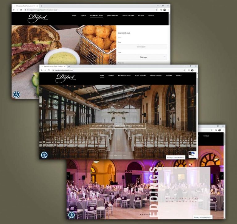
In 2017, the Depot Minneapolis was going through an identity crisis. On March 11, 2017, they permanently closed their iconic ice rink. A couple of years prior to that, they closed their water park, another unique feature that differentiated them from other hospitality and event centers. With their current website structured around the ice rink, …

Onvoy Branding

Onvoy Branding

Onvoy was a telecommunications company based out of St. Louis Park, MN. Founded in 1991, it offered a host of telecommunication solutions for all types of businesses, large and small. It was distinct from its competitors through its attitude and approach to technology. Though not nearly large as most of its competition, Onvoy was able …

Stay Twin Cities Branding

Stay Twin Cities Branding

The executive housing division of CSM Corporation decided to end its partnership with Oakwood/ExecuStay. Because of this, they were in need of a new identity. Through research and speaking with them, Stay Twin Cities was developed. Their primary differentiator from their competitors was that they were “executive housing with a heart” so the bright yellows …

Karate Junction Branding

Karate Junction Branding

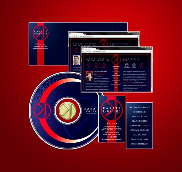
Karate Junction was a martial arts and training facility with a long history in North West St. Paul, MN. It offered a diversified curriculum that will suit anyone regardless of fitness level or experience. Whether aerobic kickboxing, strength-training Russian Kettlebells, core-training Pilates, or the muscle discipline of karate, the staff at Karate Junction had the …